identity
logo design, stationery, visual story, graphics
Skills
Art direction, design, prepress, color theory, typography, storytelling
social enterprise
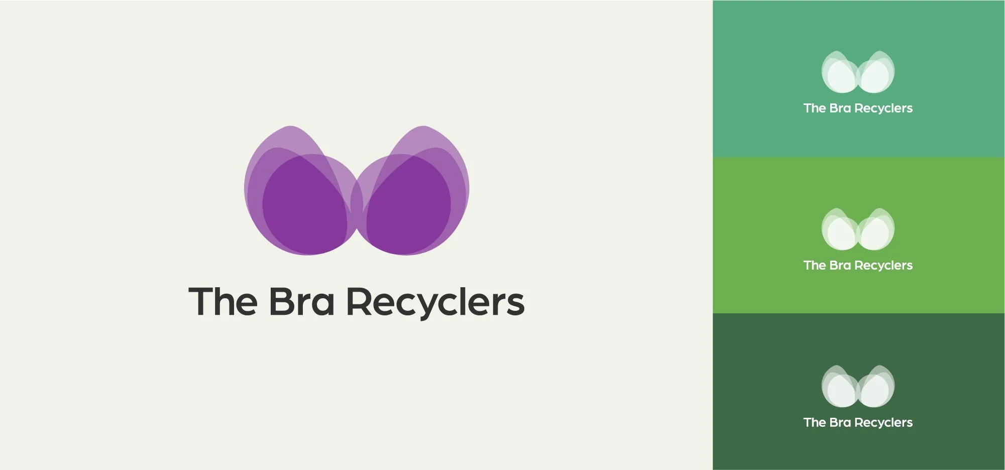
Reminiscent of the fluttering of butterflies’ wings, a known symbol for transformation, the mark contemplates the physical and chemical transformation of textiles, while reinforcing the intimate and emotional reliance in undergarments via the element of transparency.
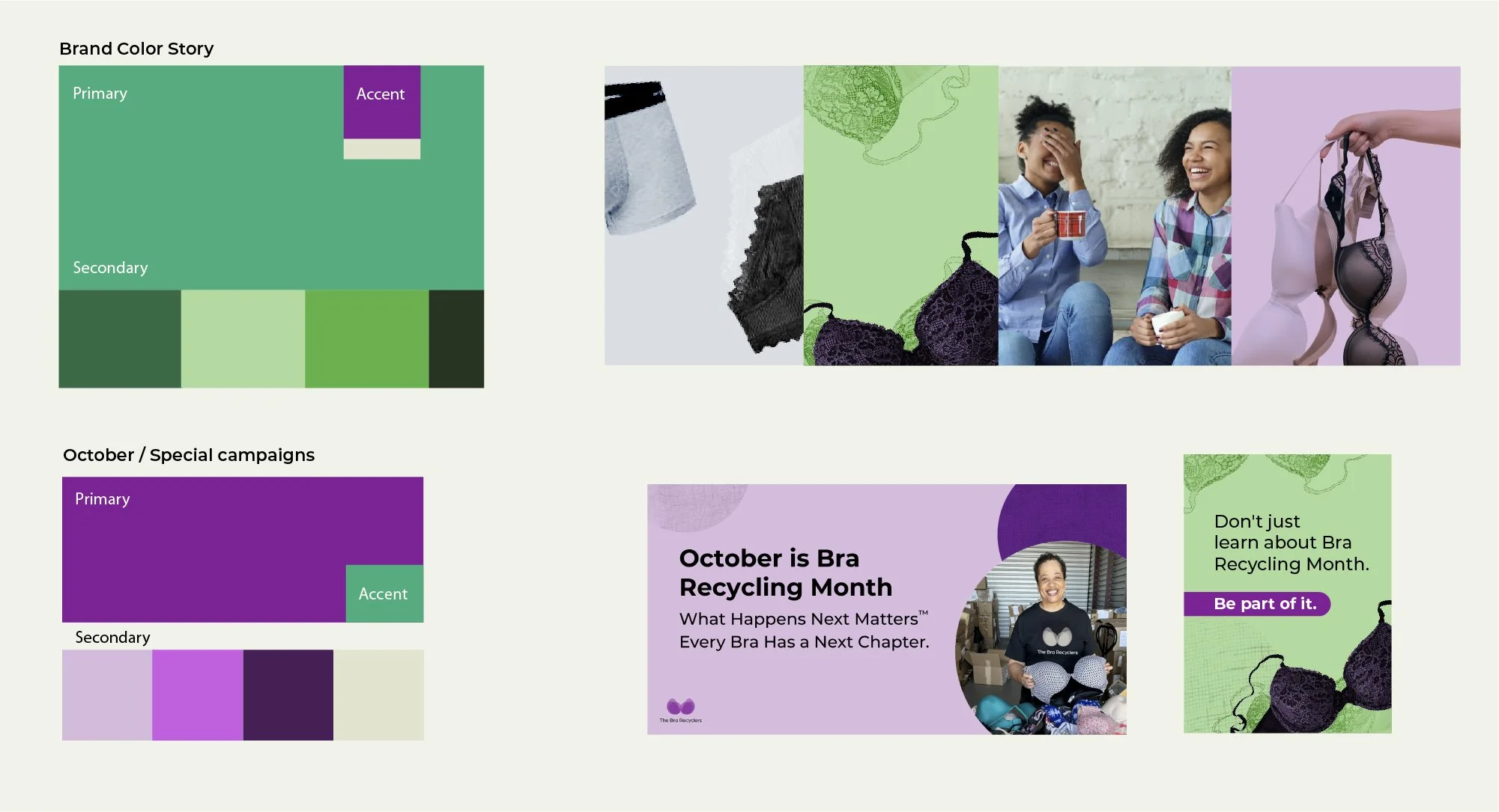
The brand’s color story focuses on purple, as a nod to the movement of bringing awareness to violence against women, with the additional use of green, used to highlight textile recycling.
Architect Studio
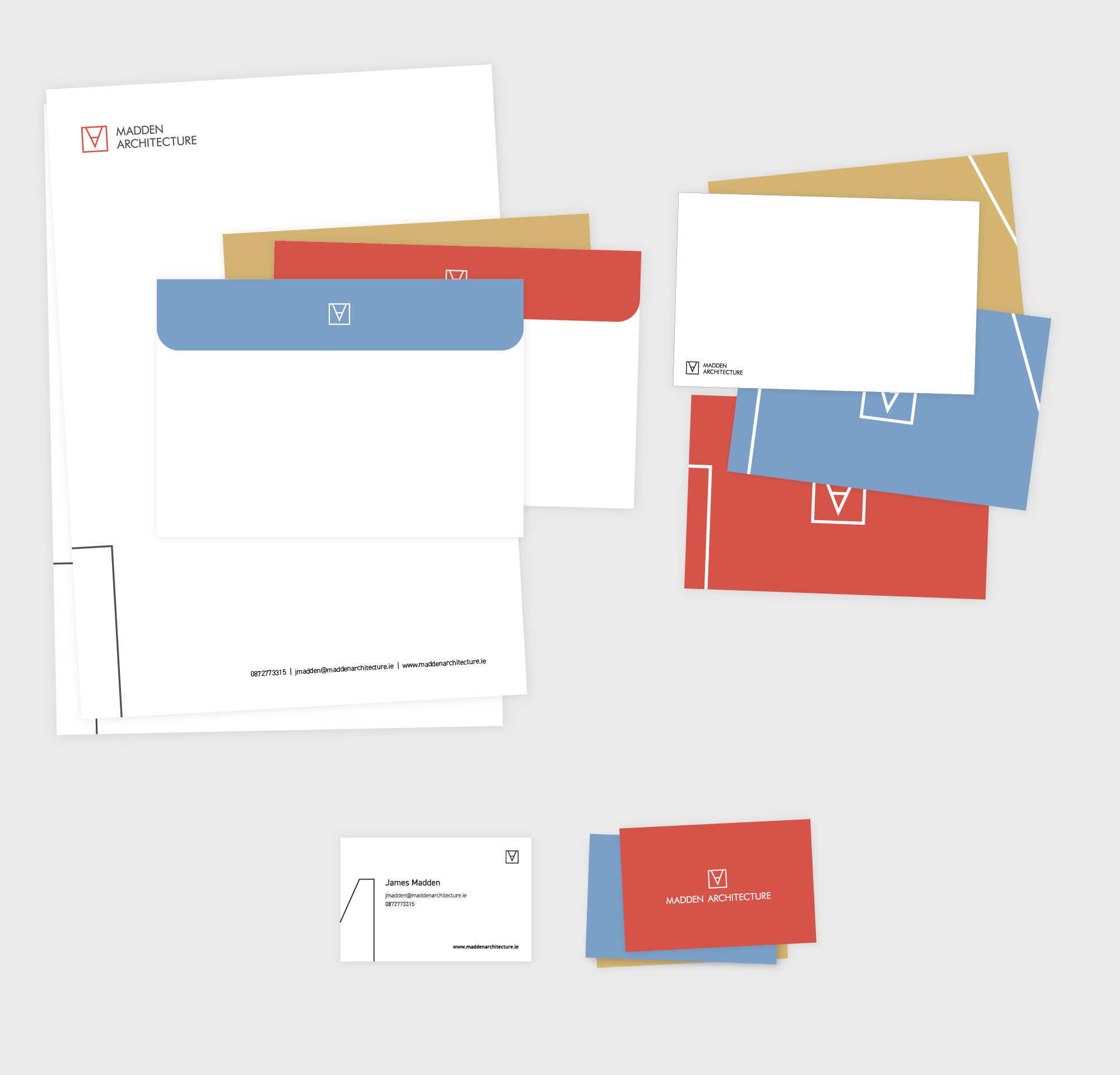
The logo mark is inspired by the process of bringing pencil to paper. The mark highlights the drawing process while simultaneously creating a monogram.
The identity relies on the use of dynamic lines and active white space, as it utilizes an interchangeable color scheme based on construction materials, and an adaptable logo providing flexibility.
Photography Studio
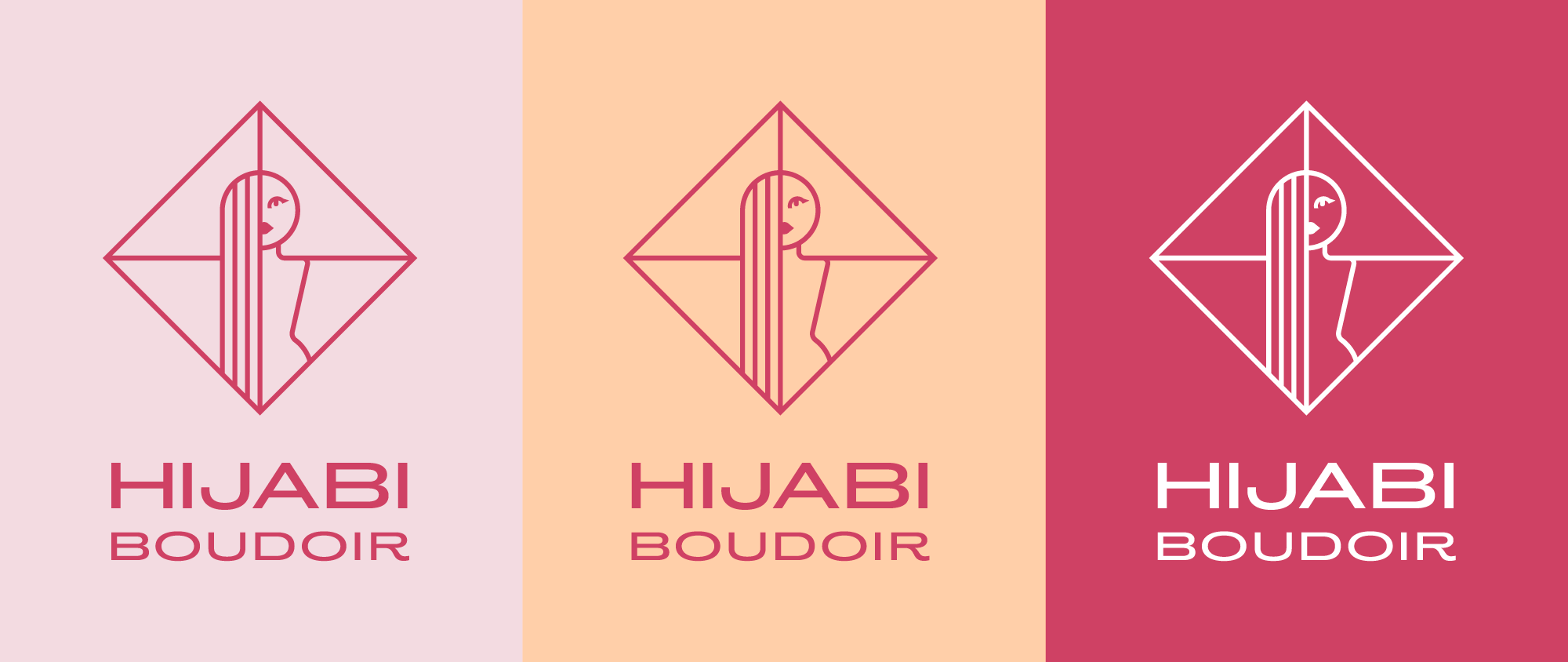
Taking inspiration from the underlaying femininity of Art Noveau, the logo celebrates womanhood and its power. Boudoir photography, due to its sensitive nature, is often misunderstood, so it was important to highlight a woman's independence and boldness. The use of thick strokes and geometric tendencies reflect this strength, which, in turn, contrast the traditional color choice and decorative font.